Cité de la Musique Genève - Logo proposal
International architecture pitch for the new opera house in the
cultural epicenter of the international Genève. The competition was concerned with unification of three institutions (namely the “Cité de la Musique”, “the Orchestre de la Suisse Romande” and “The High school of Music, Genève”) under the same roof with the name of “Cité de la Musique Genève”.
From the architecture perspective, the focus is given to the lively and social dimension of the new building which is focused on the concept of the “void”, an open plaza aiming at celebrate interaction among different targets both from the public and the private sphere. The visual identity focuses on the empty and the full volumes of the building, starting from its highly geometrical shape.
The three physical layers of the building have been taken as main reference for the visual narrative; the result is a logo both sculptural and functional in its shape, it refers both to the architecture and also to the music idea of the pentagram.
The logo can be seen in fact as a fixed “creative” grid that can guest multiple and diversified content.


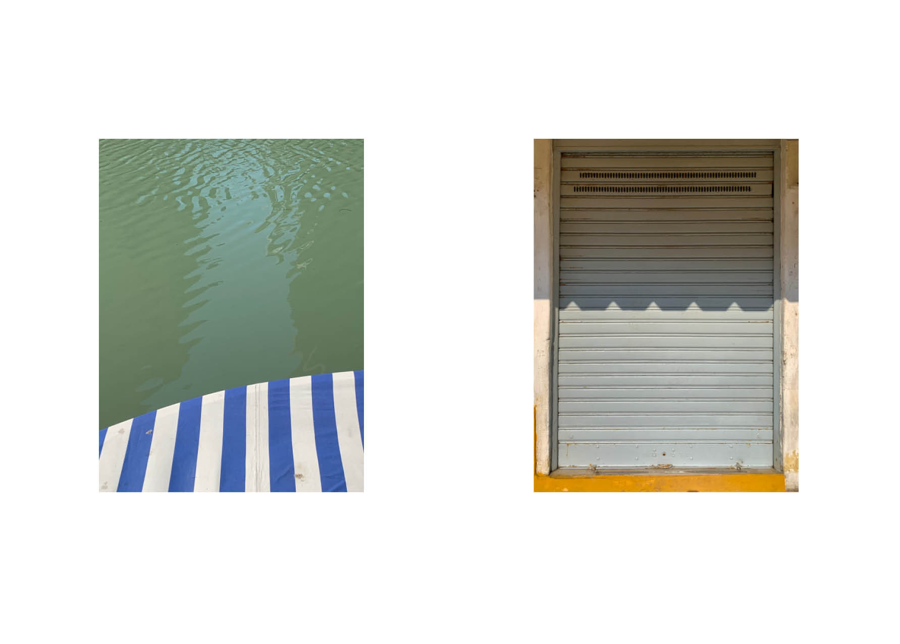
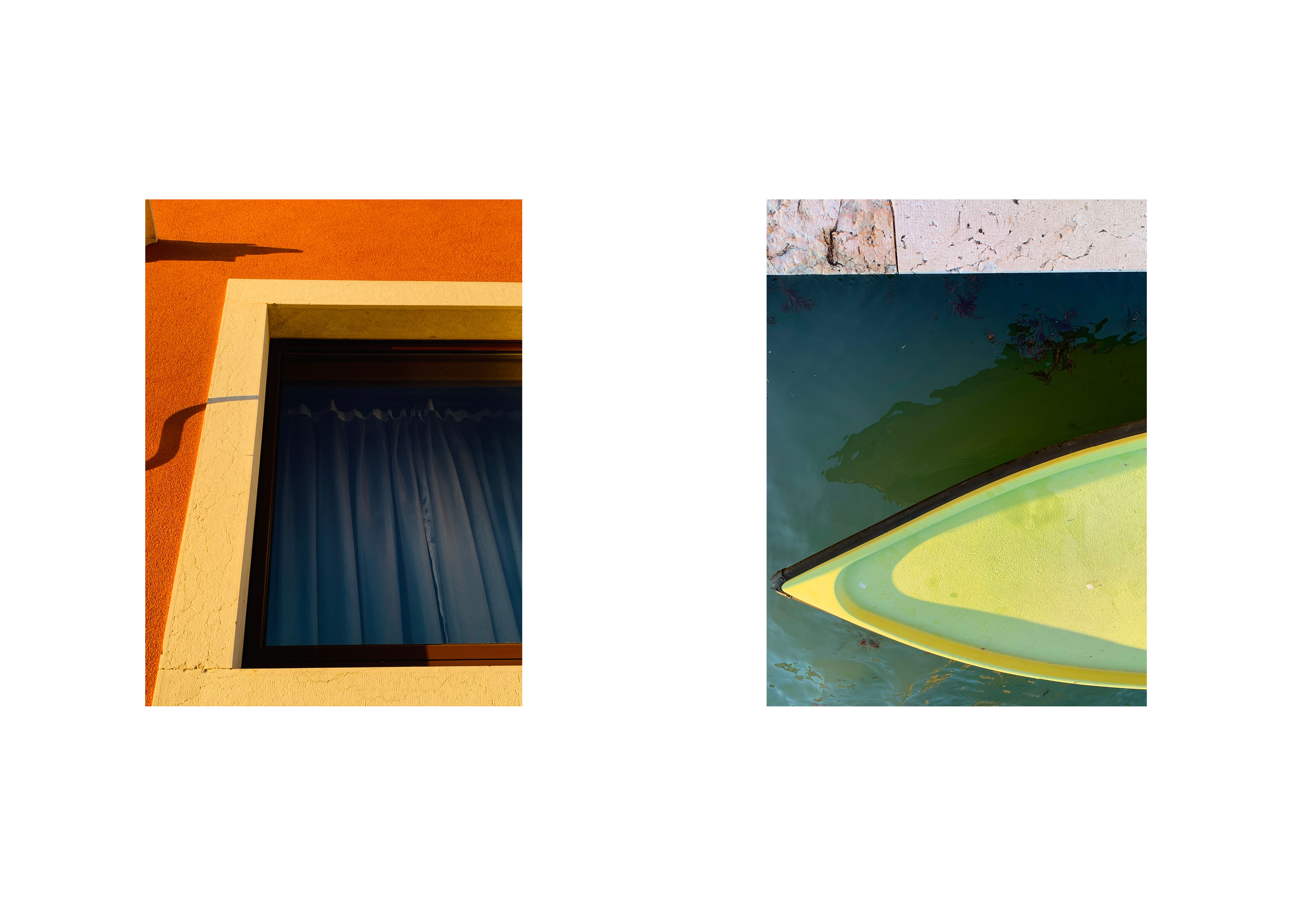
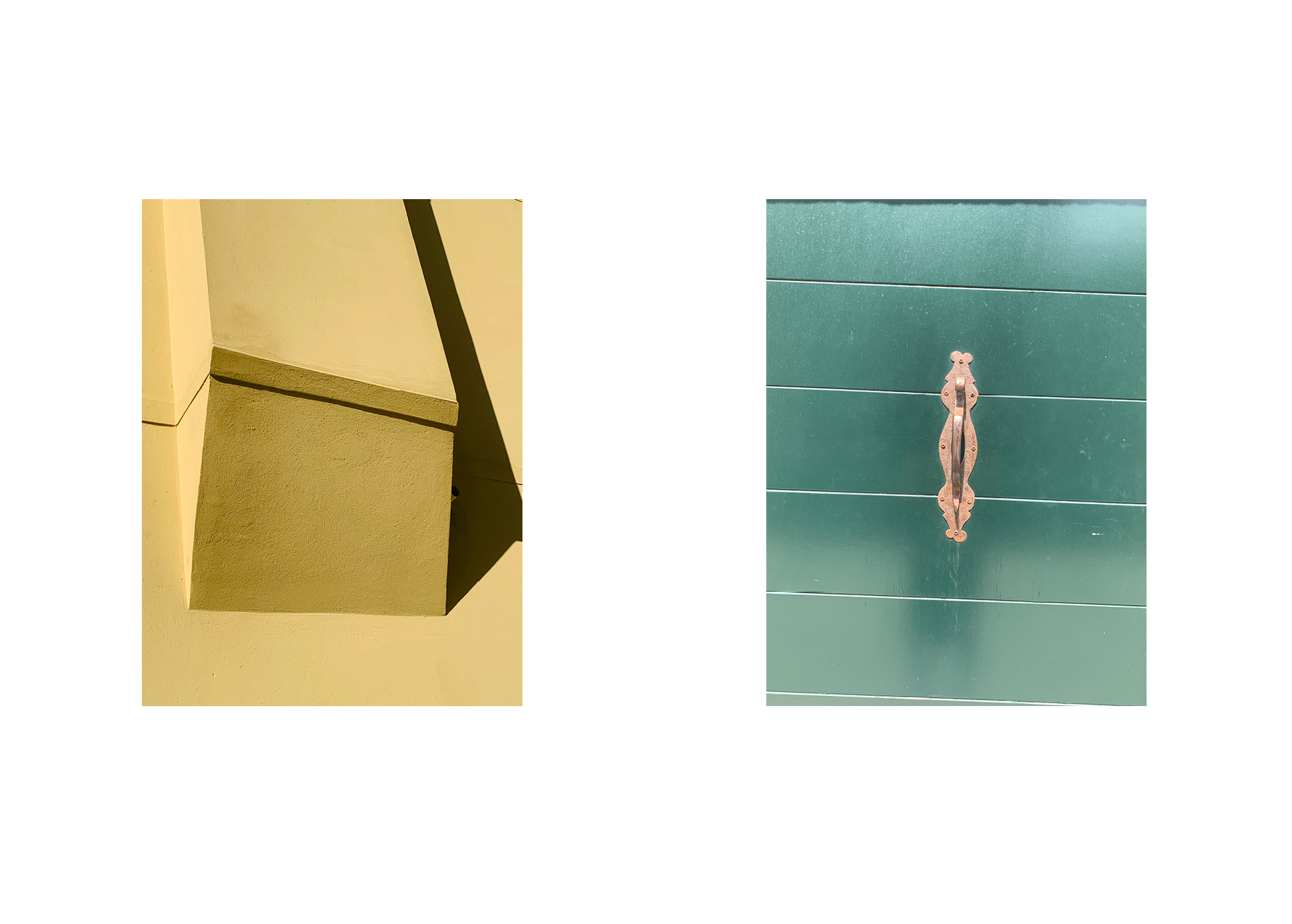
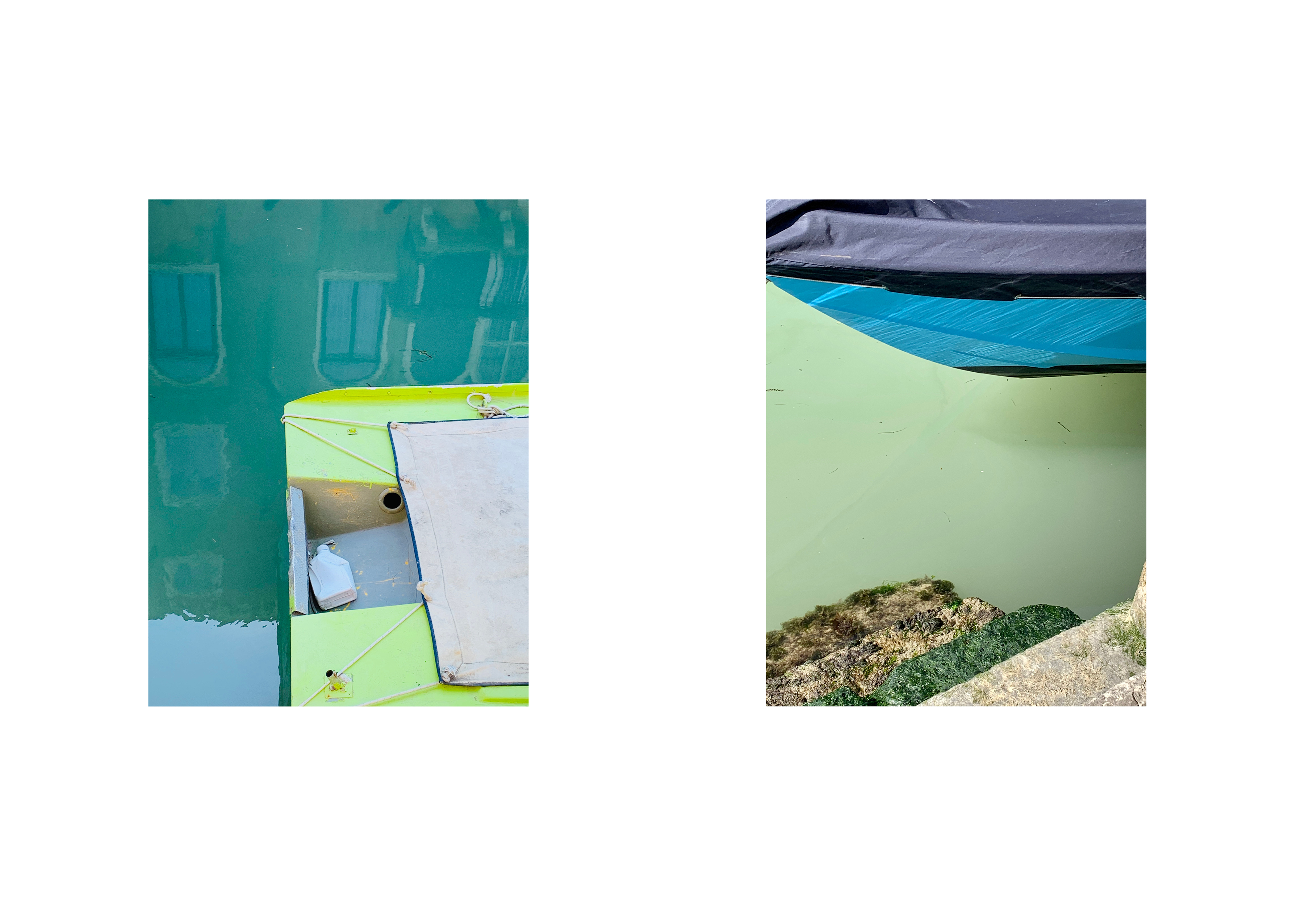
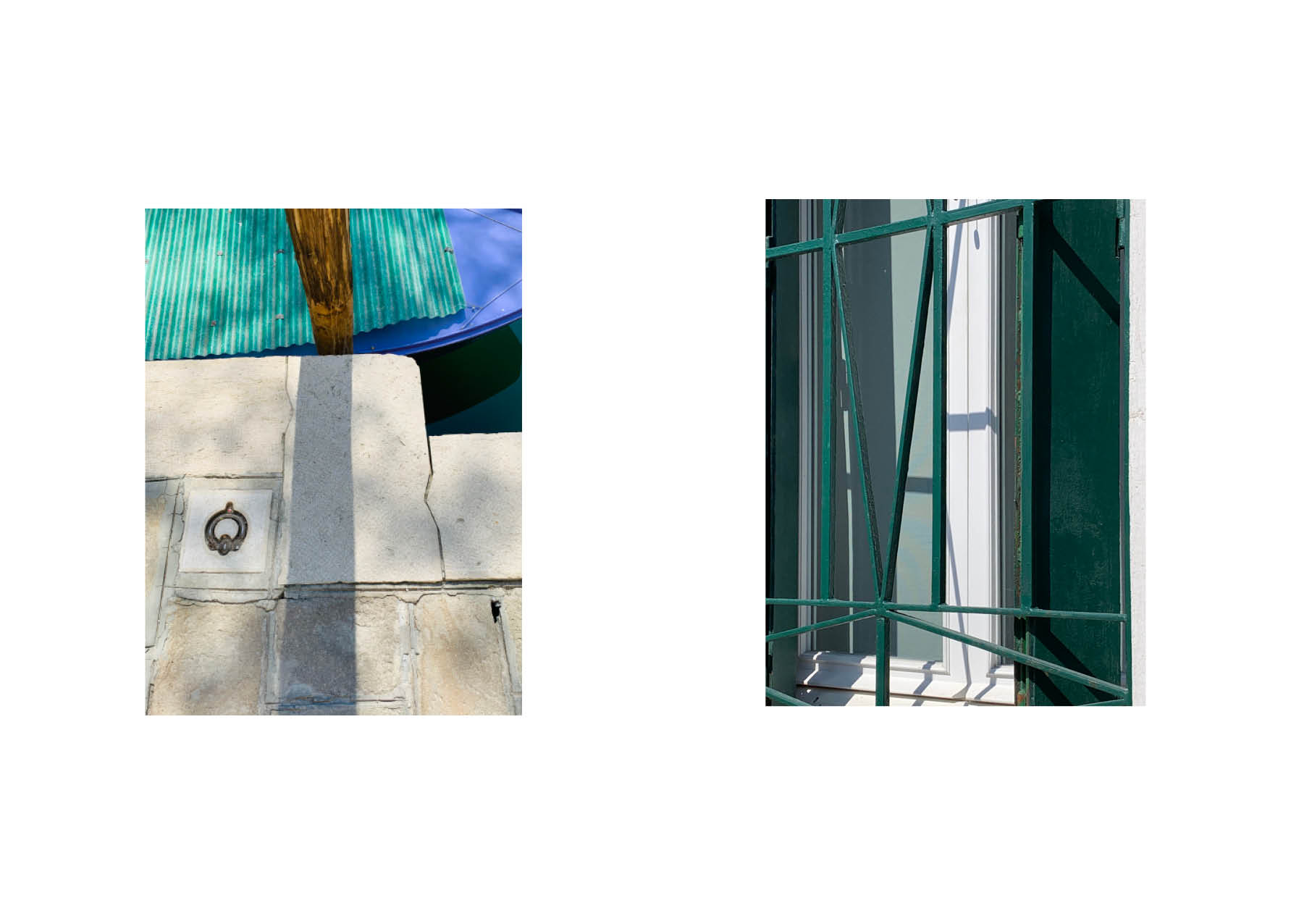
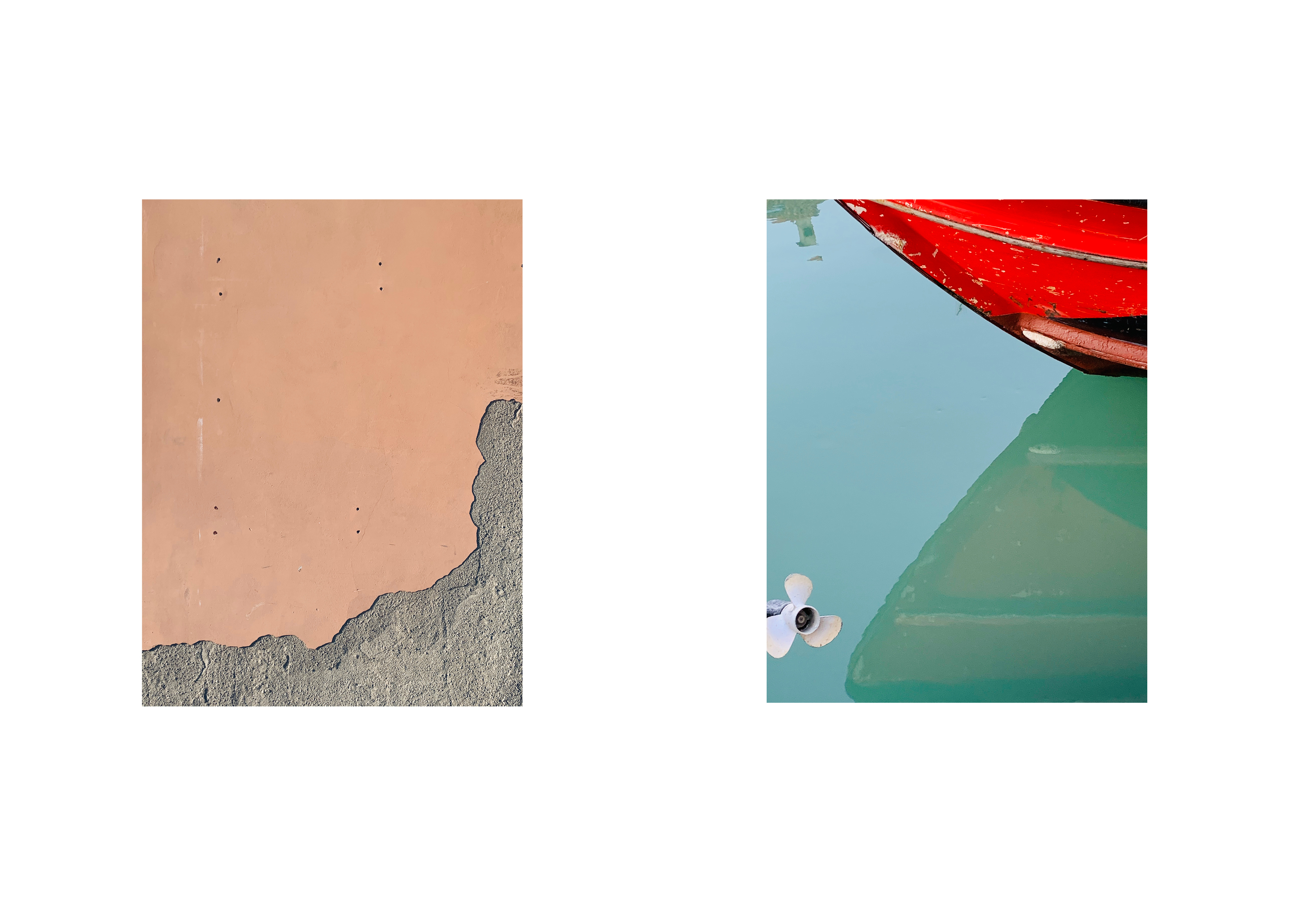
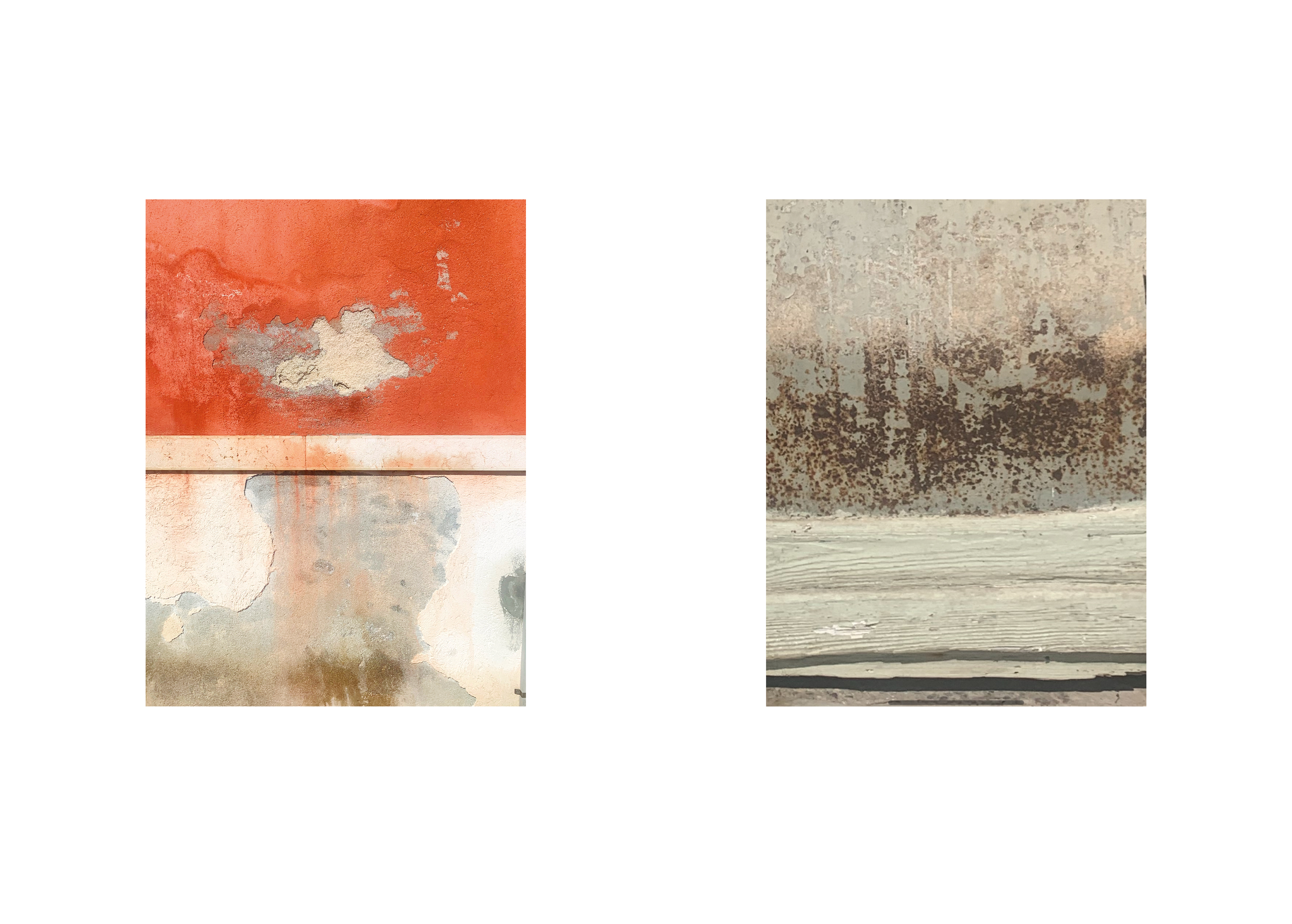
Photo-Graphic
This project combines both my passions for graphic design and artistic photography. Photo-graphic is a collection of hidden details, colorful walls and shadows, reflections on the water, seemingly insignificant objects and subjects who find their dignitiy of being represented through specific cuts and perspectives, considering photography as a creative and graphic canvas.
This project combines both my passions for graphic design and artistic photography. Photo-graphic is a collection of hidden details, colorful walls and shadows, reflections on the water, seemingly insignificant objects and subjects who find their dignitiy of being represented through specific cuts and perspectives, considering photography as a creative and graphic canvas.


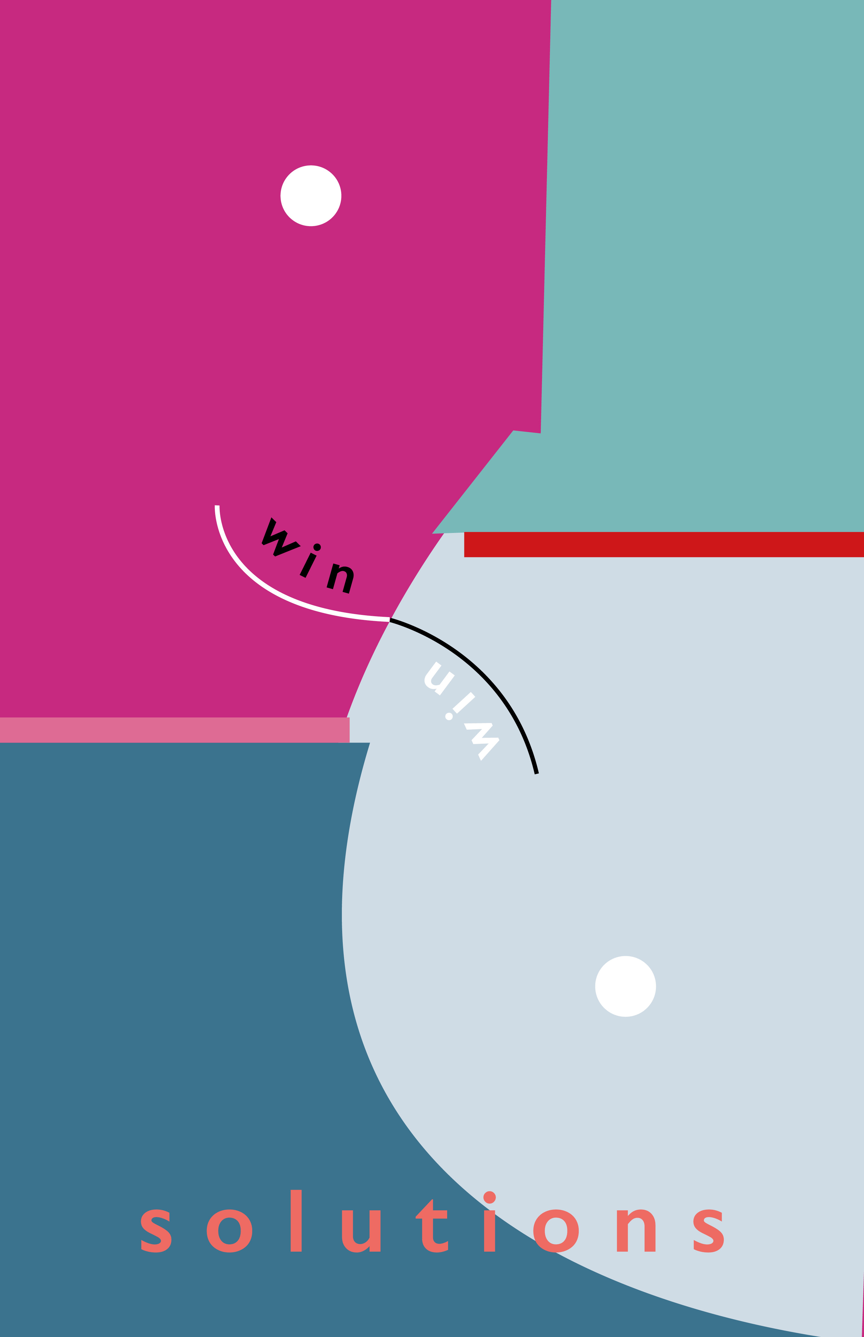
Win-win solutions
How many times do we struggle to find a solution that can make content both the two parts involved? Inspired by the economic concept and way of saying “win-win solution” these artistic representations play with thetopic of reaching a mutual deal. The forms seem to be mirrorred and symmetrical, with two curves that symbolize a unifyning smile.
How many times do we struggle to find a solution that can make content both the two parts involved? Inspired by the economic concept and way of saying “win-win solution” these artistic representations play with thetopic of reaching a mutual deal. The forms seem to be mirrorred and symmetrical, with two curves that symbolize a unifyning smile.


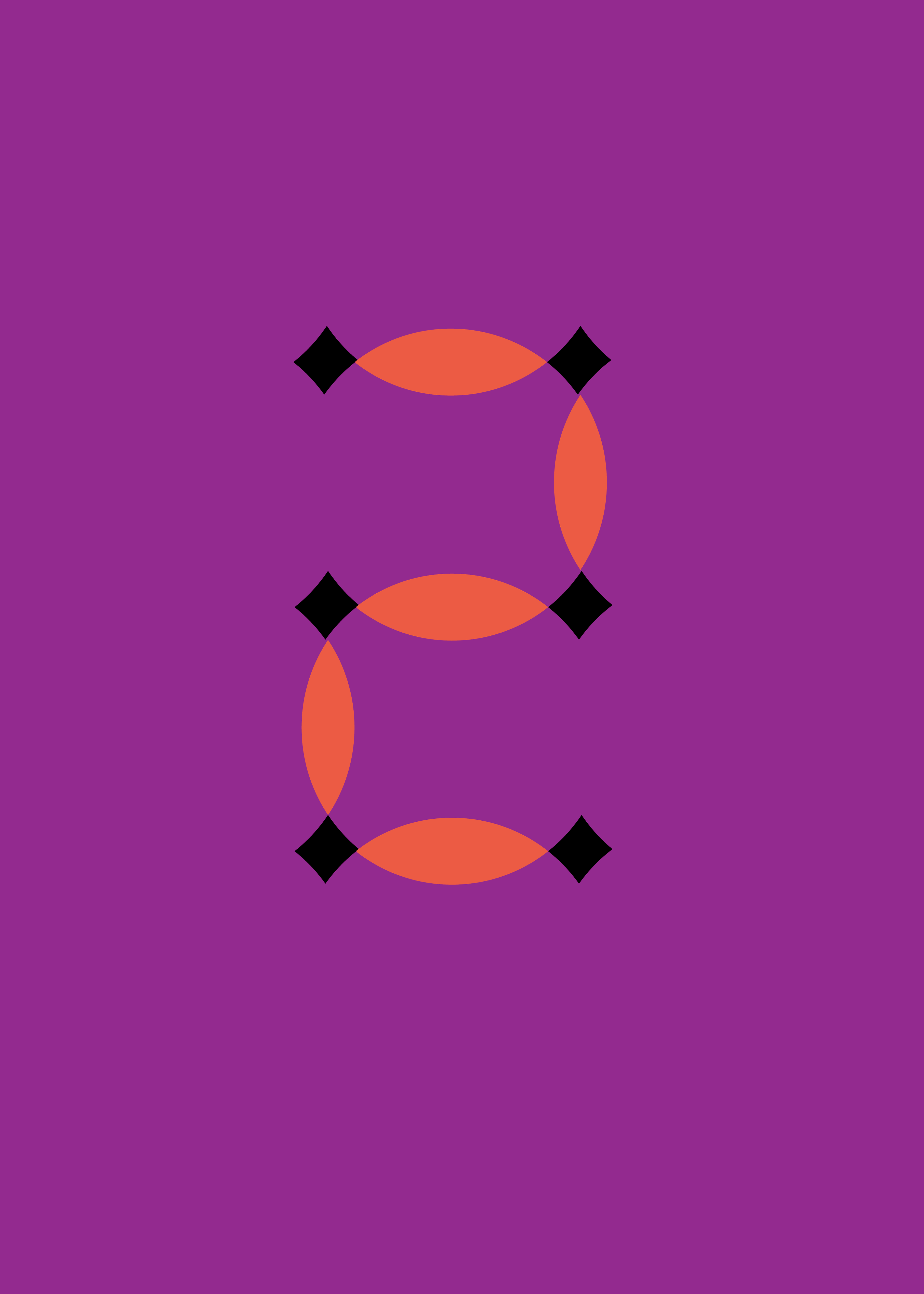
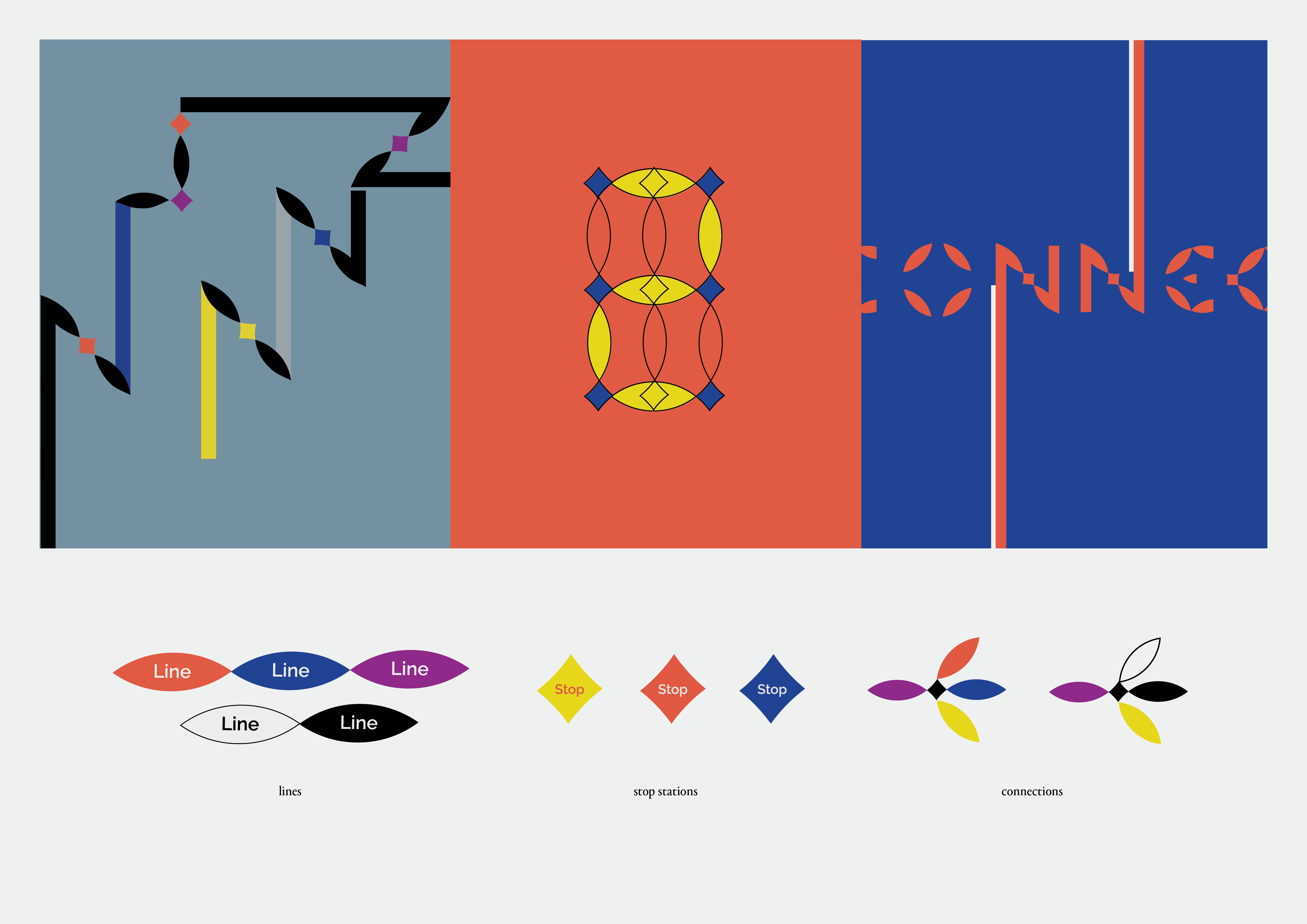
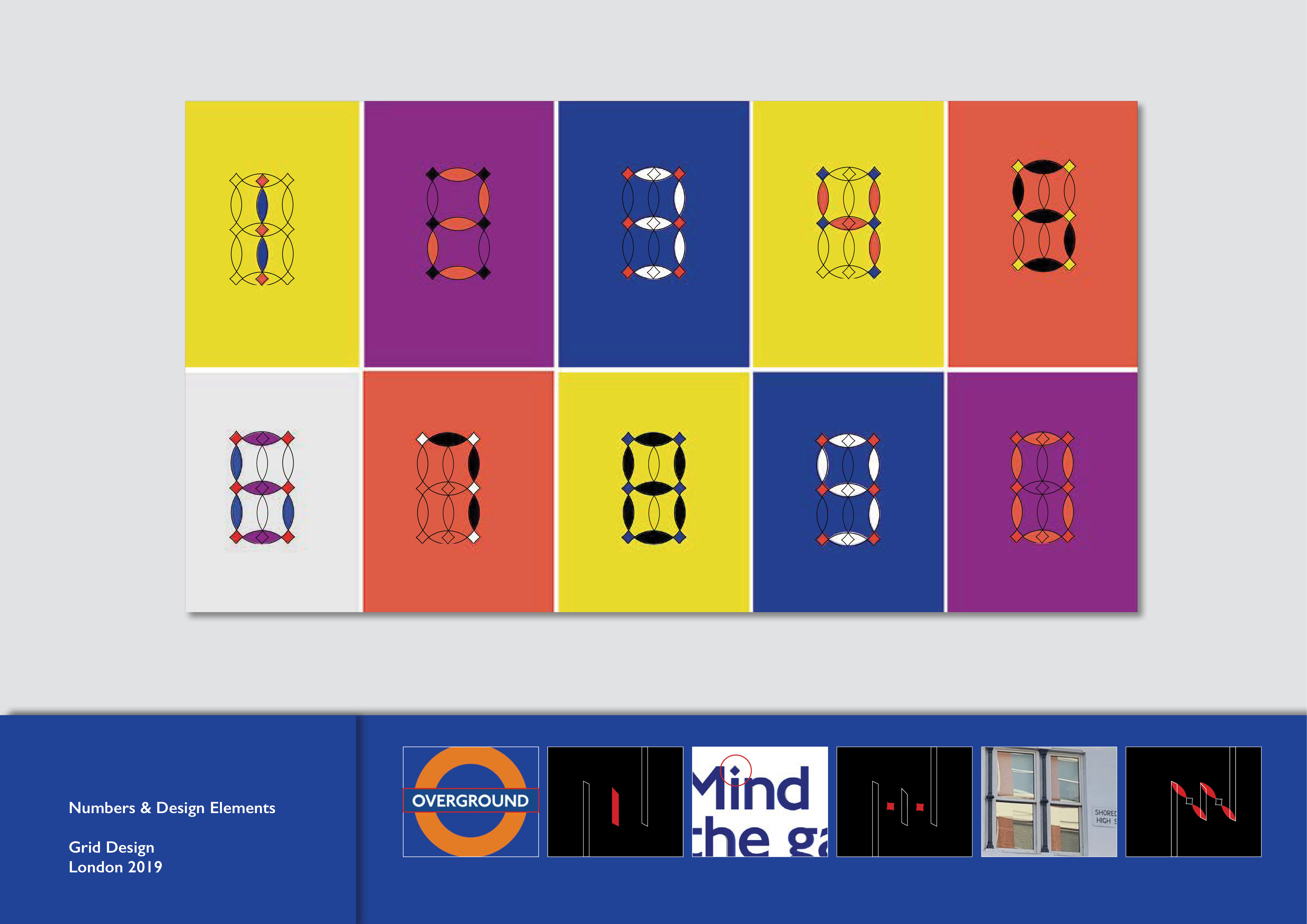
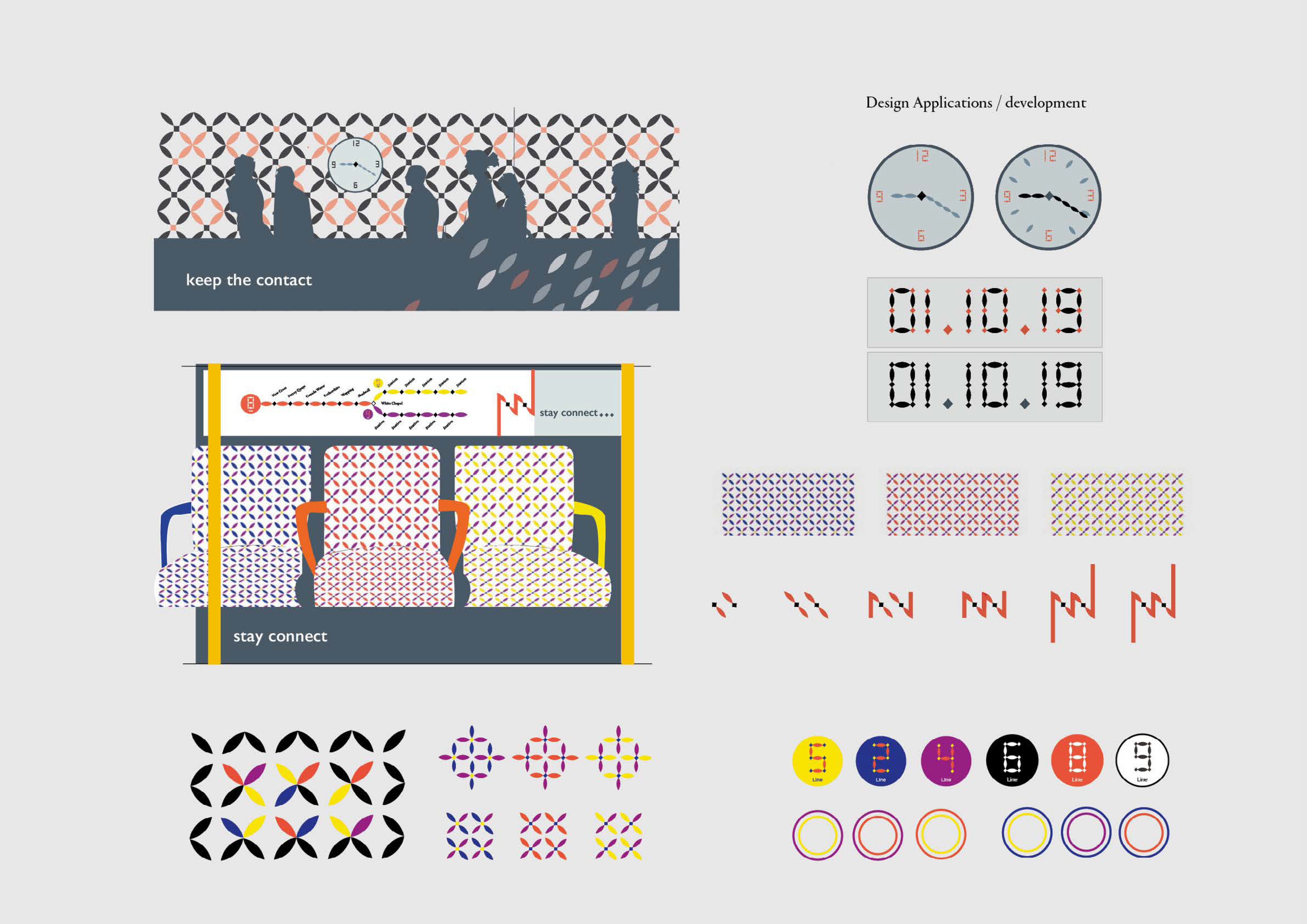
Connect
Development of a sub-brand for TFL. Connect is a self-initiated identity project for the London Overground system.
Inspired by the already-existing design such as the diamond dot of the “i”, the proposal suggest a floreal and geometric design system applicable on a series of way-finding elements and navigation systems.

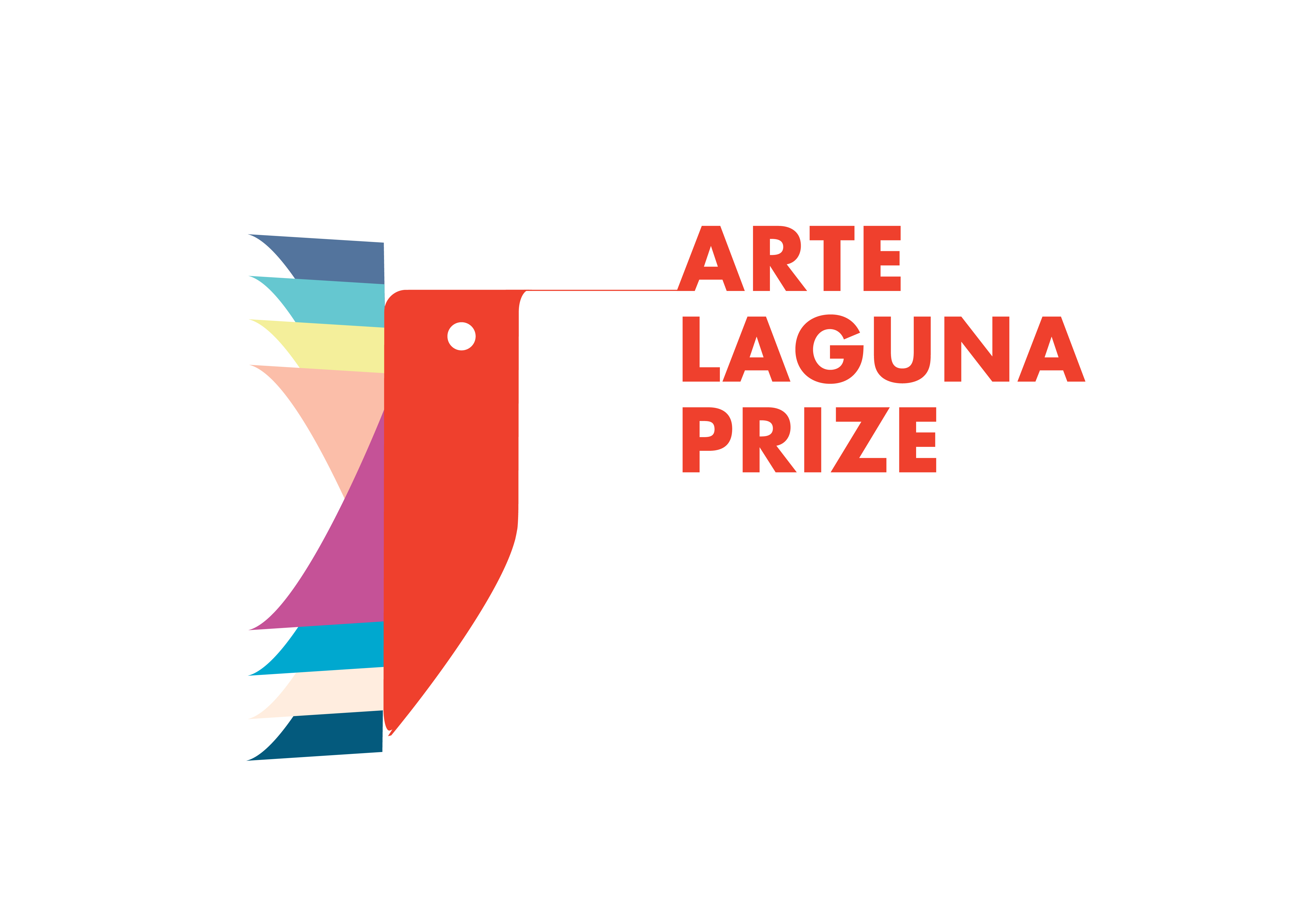
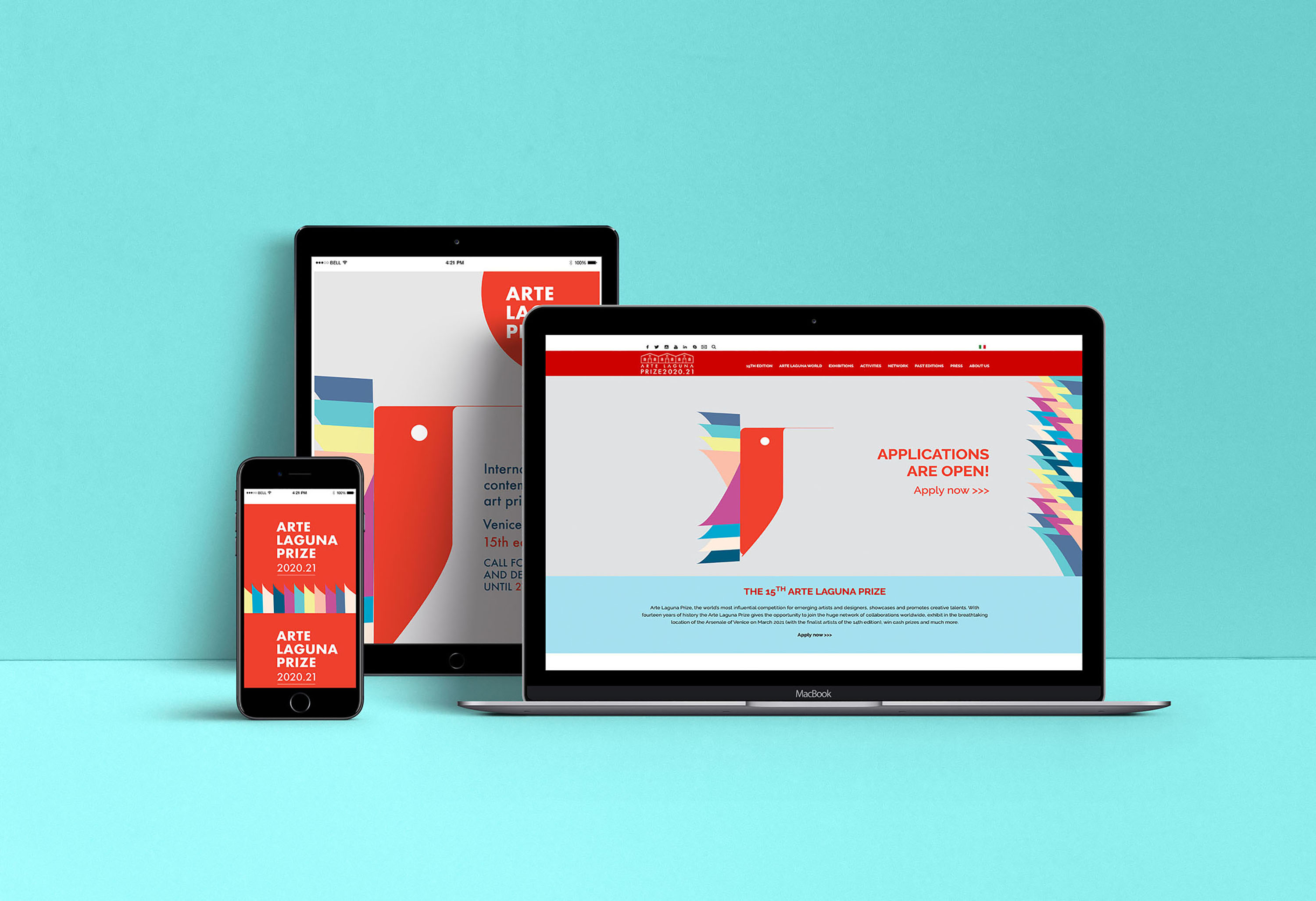
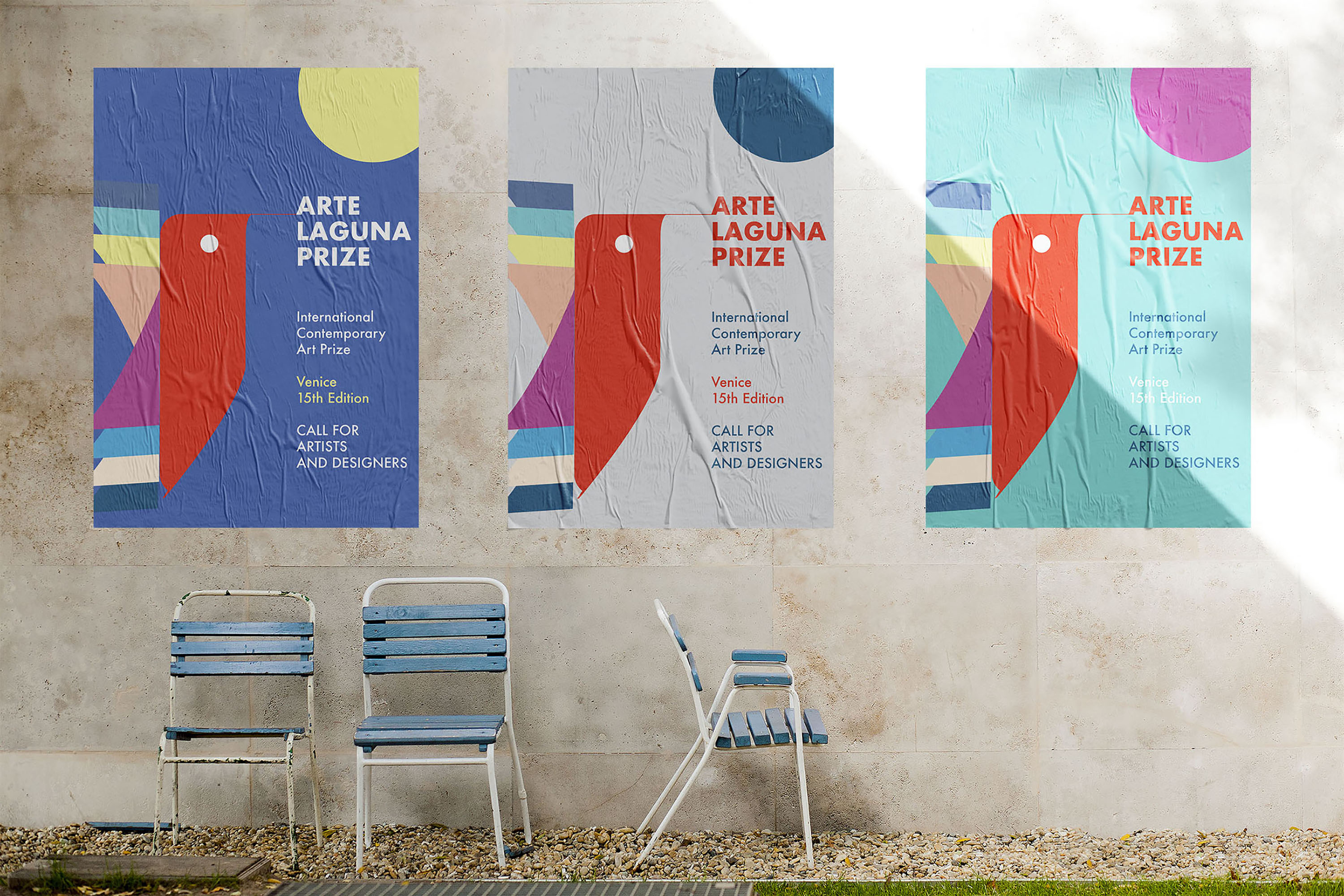
The Humming bird - Logo Design
In occasion of the 14th edition of the international contemporary art prize ‘Arte Laguna Prize’ I was asked to propose a new corporate image. After an analysis of the communication of the past years, I decided to focus on the icon and symbol of the ‘humming bird’. The icon stands for resilience, collaboration among artists and dynamism. Like an artist, this tiny bird can execute precise and unconstrained movements. The colorful wings symbolize the multidisciplinary essence of the prize with all its disciplines, as well as the internationality of such a global competition.
The hummibg bird is well-known for its colorful essence, its joyful presence. The symbol also stands for great adaptability and the capacity of overcoming difficulties. All in all, I though about conveying values of positiveness and joy for life in contrast with the turbulent and uncertain times we are living in.